Proces
Concept Ideation: Explored packaging solutions using recycled and biodegradable materials, focusing on a clean, natural aesthetic.
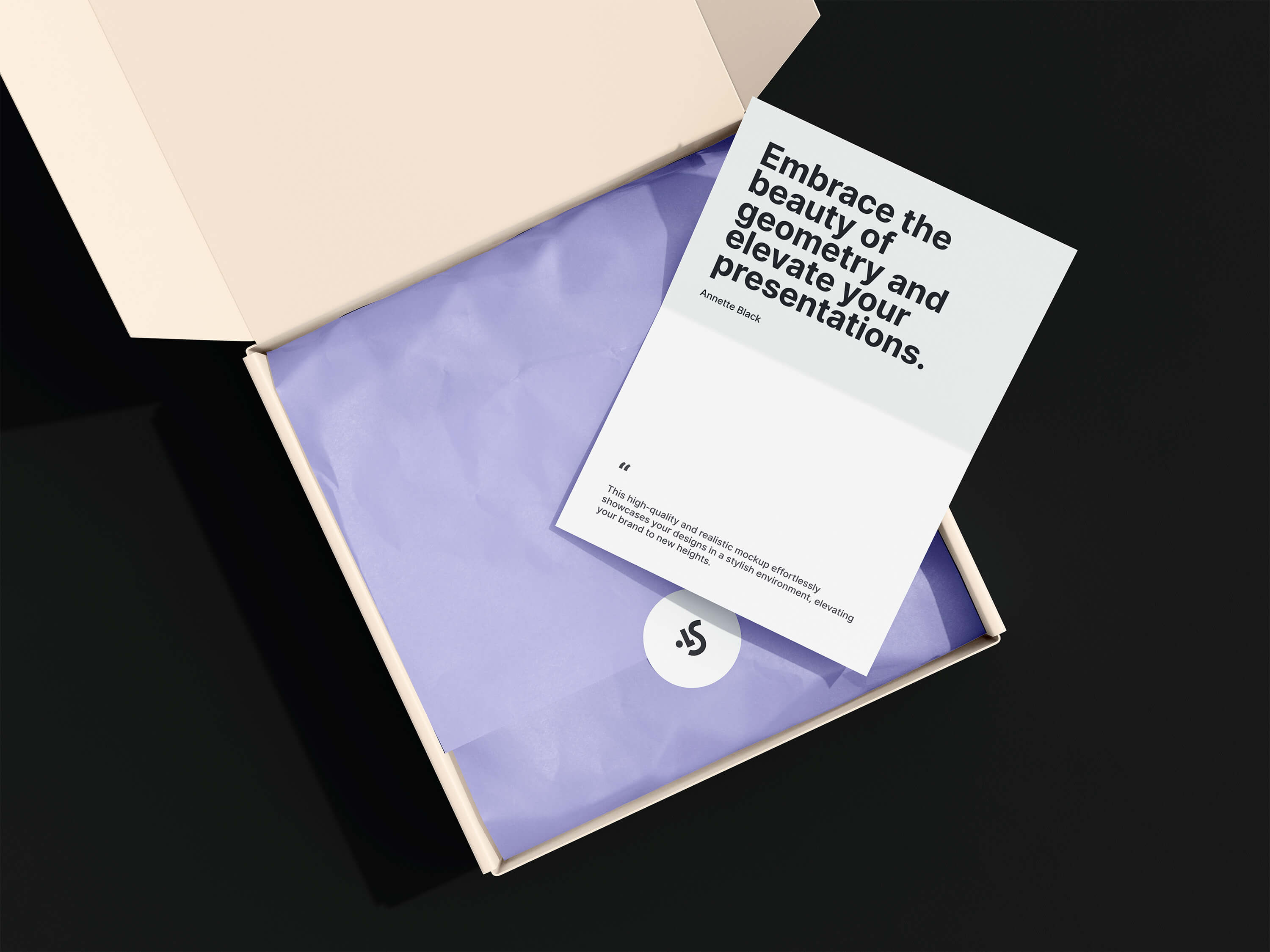
Design Development: Created a series of packaging designs featuring soft pastel colors, botanical illustrations, and minimalist typography to reflect the organic nature of the products.
Prototyping & Testing: Developed prototypes to test the packaging’s durability, functionality, and appeal, making adjustments based on feedback.
Final Production: Worked with a printing partner to ensure high-quality production using soy-based inks and sustainable materials.

Outcome
The new packaging helped Nature’s Bliss increase retail sales by 40% in the first quarter after launch, with the brand receiving praise for its commitment to sustainability and visually appealing design.