Group re-design project
3 months (April - July 2024)
Problem
Unclear event information and overload of steps in the event registration flow lead to user frustration, and inefficiencies that impact volunteer turnout.
Solution
A fresh new streamlined registration flow that makes the event booking process clearer, more engaging, and easier to navigate.
Outcome
Time to complete registration down from 6 to 2 minutes.
20% improvement
in volunteer turnout.
I was the sole UX designer on a team of two business analysts, a product manager, and a data analyst. I was responsible for shaping the overall design direction of this project. I encouraged early ideation and collaboration with the rest of the team throughout the project
4 min read
My Design Process
Research & Planning
Understanding the problem
Overview of volunteer journey
Heuristics review
Defining re-design goals
Success metrics
Competitor Analysis
Context
Prologue
Volunteering is meant to be engaging and fun, but the ongoing process of registering for events with Kaipātiki Project was clouded by confusion, draining the excitement before it even began.
"If only this was designed better", I thought, frustrated with the user journey for registering for an event.
That thought sparked this case study, where I reimagine the event registration experience to make it intuitive, stress-free, and enjoyable for everyone, from new volunteers to experienced people.
Let's see how I got there…
Understanding the problem
Volunteers found the registration process too lengthy and confusing
Based in Auckland’s North, Kaipātiki Project is an innovative EcoHub, growing a sustainable future for people and nature. During my IT graduate studies, me and my team of 5 stopped by to tell them about our case study idea.

We spoke with Blanka, communications & engagement lead, who outlined some of their biggest pain points when it comes to volunteers booking events online.
Blanka first let us know that Kaipātiki Project is involved in a variety of activities including:
collecting seeds locally
repotting
looking after seedlings
restoring forests
growing food
running various workshops like compost hub and zero-waste initiatives
Even though our redesign is hypothetical, knowing this from the start helped us focus on improving the user experience while keeping these details in mind. I wanted to make changes, but not so drastic that they strayed too far from what’s already in place. This balance is important because it ensures the designs are practical and could be more easily adapted, even if they aren't implemented right away.
The biggest pain point is that 9 times out of 10 volunteers find the registration process confusing or too lengthy, so they either abandon it halfway or submit incomplete forms. You can imagine how frustrating it is to lose enthusiastic people simply because signing up isn’t straightforward!
-Blanka, communications & engagement lead
This interview was important because it provided valuable insights into the operational challenges and business goals that would inform the direction of my re-design
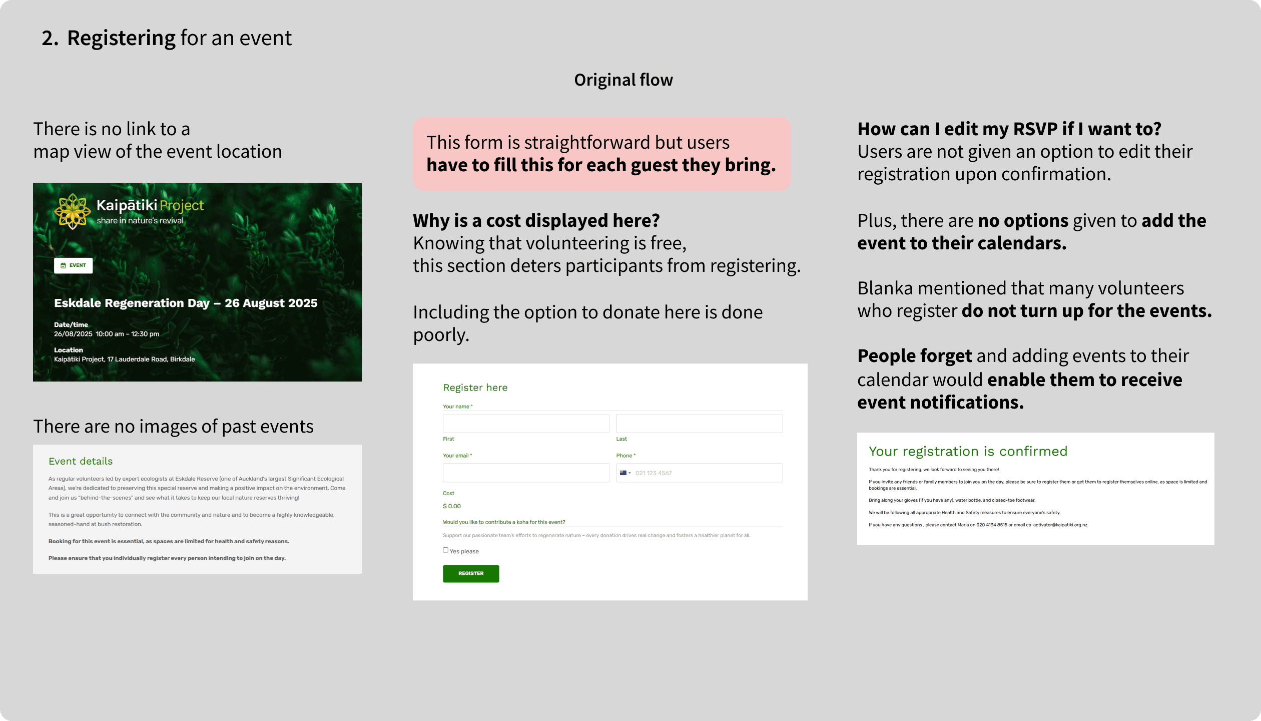
Blank also mentioned that whenever volunteers turn up, they have to fill a health and safety declaration form that usually takes up to 10 to 15 minutes depending on the group size. She suggested that if this process could be done digitally, it could save time for the staff and volunteers.
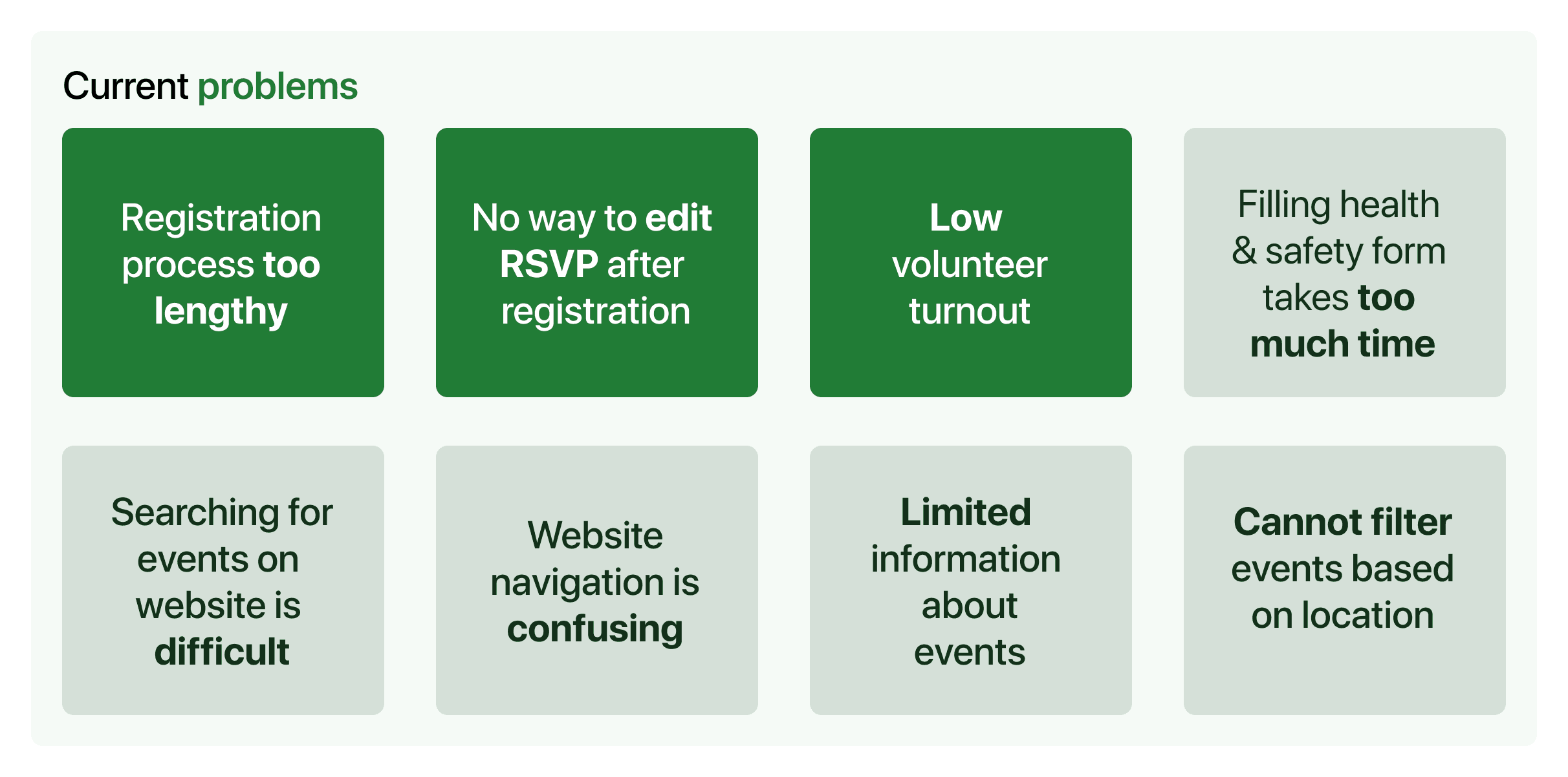
As the current process did not offer a way for volunteers to edit their registration, they would need to email Kaipātiki Project in order to change or cancel their booking, costing further time and effort.
When I approached volunteers, they often were not aware of events in their local community and expressed difficulties in locating where to register for these events.
A lack of a mobile app was mentioned by a majority of volunteers, as they found it cumbersome to search for events on the mobile view of the website.
Problem statement
David is a nature and environmental lover who needs an easy app experience to register for reforesting events closer to home.
Overview of volunteer journey
🧑💻 Volunteer books an event online
🗣️ Arrives at the location, tells staff first and last name
✍🏼 Fills health & safety declaration form
🌱 Carries out planting or restoration work
💼 Staff debriefs volunteers at the end of the work, and thanks them for their attendance
Contextual inquiry
To explore and validate these insights from Blanka, me and my team set out to visit their office and see how they are doing volunteer activities currently.
They had a big plant nursery behind their office premises that they used to grow and take care of seedlings and carry out compost hub workshops (their community workshops aimed to composting kitchen waste).

Usability tests of current flow
To explore and validate these insights from Blanka, I carried out usability tests of the current flow with 2 of my friends who I had been volunteering with.


Setting the scene
I created a scenario which focuses on tasks like navigating and registering for events, capturing the key challenges Blanka shared to make the test more relevant and useful.
💡 For this redesign, I focused only on the event registration aspect of their website. With just 4 weeks and being the sole designer in my team, I had to keep the scope manageable. If testing went well, I had more time, and the designs were actually rolled out with a whole team, I'd apply the same improvements to the workshops and donations sections too.
🌱 You’re registering for an event online with Kaipātiki project to plant trees in your local area. You've volunteered for them before and consider yourself knowledgeable. As you go through the registration process, talk me through your thought process.
✍️ On the event registration review page…
You realize the date conflicts with another appointment.
Update the RSVP and explain your thoughts as you do so.
Key insights from usability tests
To establish a baseline for comparison, I measured key success metrics during user testing of the original reservation flow.
I also summarized the major issues which came to the surface.
Major issues
👎 Users had to navigate to different pages and do a lot of scrolling to locate the booking button for events.
👎 Confirmation page - users could not easily go back and edit the RSVP if something was incorrect, this caused a lot of stress!
👎 Users cannot add the reservation to their personal calendar after registration.
👎 No links to the actual location of the event leading to more cognitive efforts.
👎 Users cannot complete a group booking in the same flow.
Metrics
🕝 Average time to complete registration 6 minutes
🕝 Average time taken to create a group booking for 4 people
8 mins
On a scale of 1-10, how easy did you find the event registration process?
10 = piece of cake, so easy loved it
1 = not easy at all, don't make me do it again
Average ease rating: 4
Heuristics review
Building on what I found in the first round of usability tests, I did a heuristics review, which highlighted a lot of the same issues and guided improvement ideas. You can see an overview of my heuristics review report here.
In addition, I created a user flow chart for the current registration process as shown below:


Defining my specific re-design goals
Simplify the registration flow to ease cognitive load and improve usability.
Provide the ability to edit the registration after reservation, giving volunteers more flexibility.
The contextual inquiry, meetings with Blanka and the volunteer journey pointed me towards designing a fresh mobile app, rather than redesigning their current website.
Ability for volunteers to fill a health and safety declaration form upon arrival at an event site.
Include more information about events and details about who's attending so that volunteers are properly informed.
How will I know if I've been successful?
There will be a decrease in the overall time taken to register for an event, ease rating will increase and volunteer turnout will increase.
Competitor analysis
Defining my redesign goals before helped me stay focused when analysing competitors.
For this redesign, it was worth drawing inspiration from other environmental organizations.
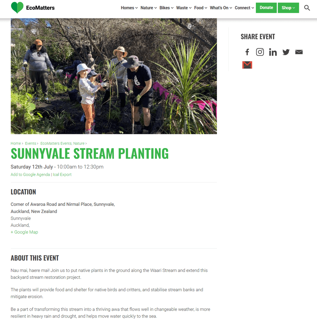


EcoMatters has no registration process and only displays event info.
Conservation Volunteers New Zealand has a clunky interface to view events and requires to signup/login to register.
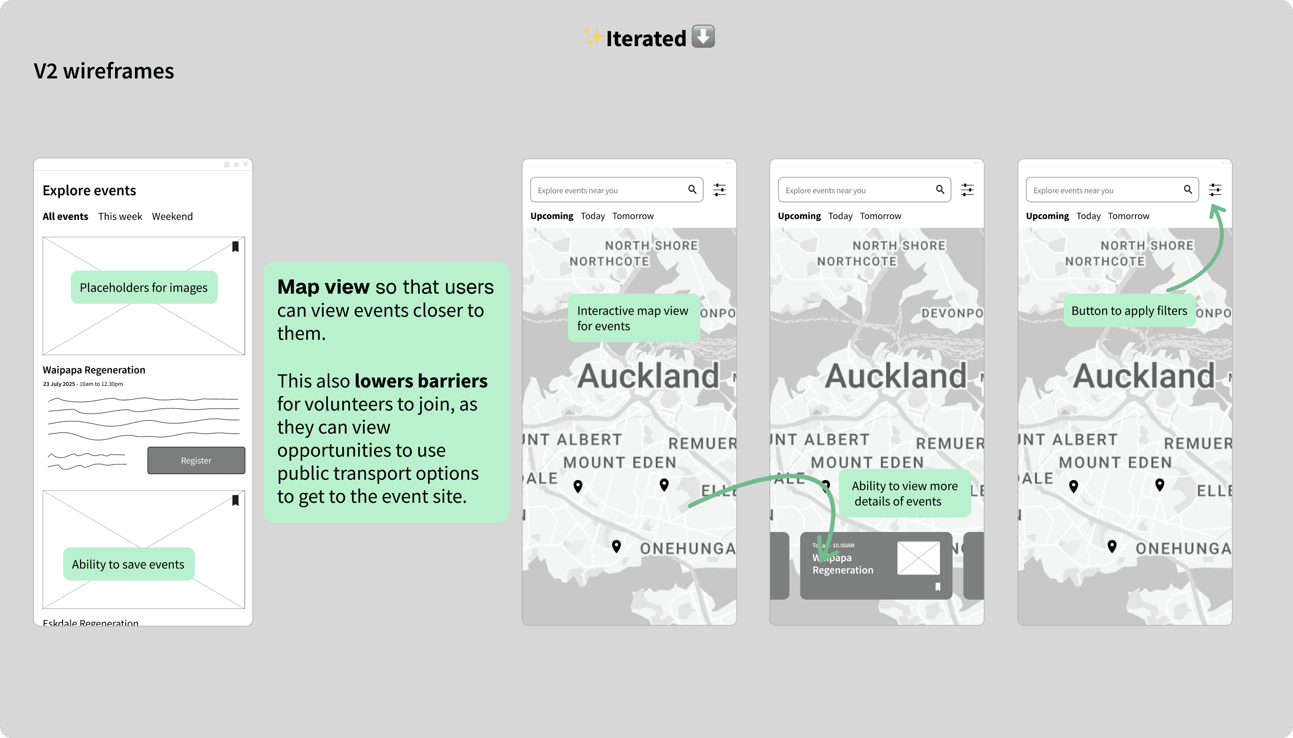
Sustainable Coastlines allows easy switching between events, and provides a map view of the location. However, there is no way to edit the reservation after confirmation.
New user flow
Inspired by competitor insights, I sketched out a new user flow, focusing on adding multi-person booking guidance and making the whole process simpler and smoother.
Below is the flow for registration for the proposed mobile app:


Below is the flow for filling the health & safety declaration form for the proposed mobile app:

What were the design constraints?
Wide age and tech-literacy range among volunteers, from school groups to retirees; therefore flows must be self-explanatory and forgiving.
Accessibility compliance at WCAG 2.1 AA level is mandatory for public-facing NZ services.
Initial wireframes and feedback
With the new user flow ready, I used Figma to sketch version 1 wireframes and created a rough prototype. My goal was to prioritize user experience on mobile screens, ensuring simplicity and functionality.
I got some initial feedback from my partner and brother. I gave them the same scenario, prefacing that this was a very rough V1 prototype to test the overall layout and flow.
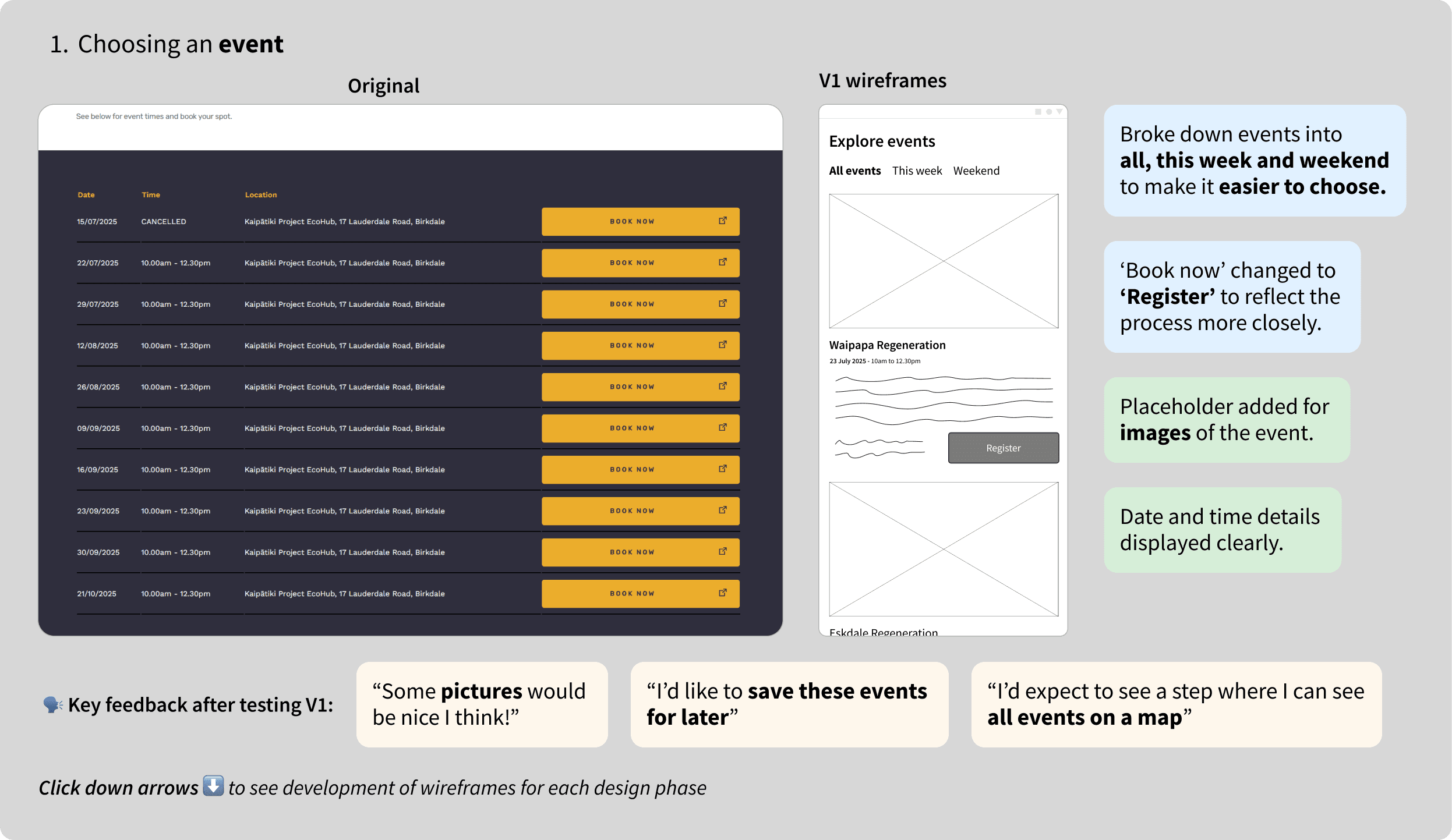


Key insights from user testing
"This flow is easy and seamless" 🤩
"It's nice that I can now add multiple people in the same place without having to add them separately"
"Do I have to enter emergency contact details each time I register?" 😤
Rapid testing of new flow for mobile
I quickly developed rough a prototype for mobile to test the registration flow. Below is a screenshot of the mobile prototype.

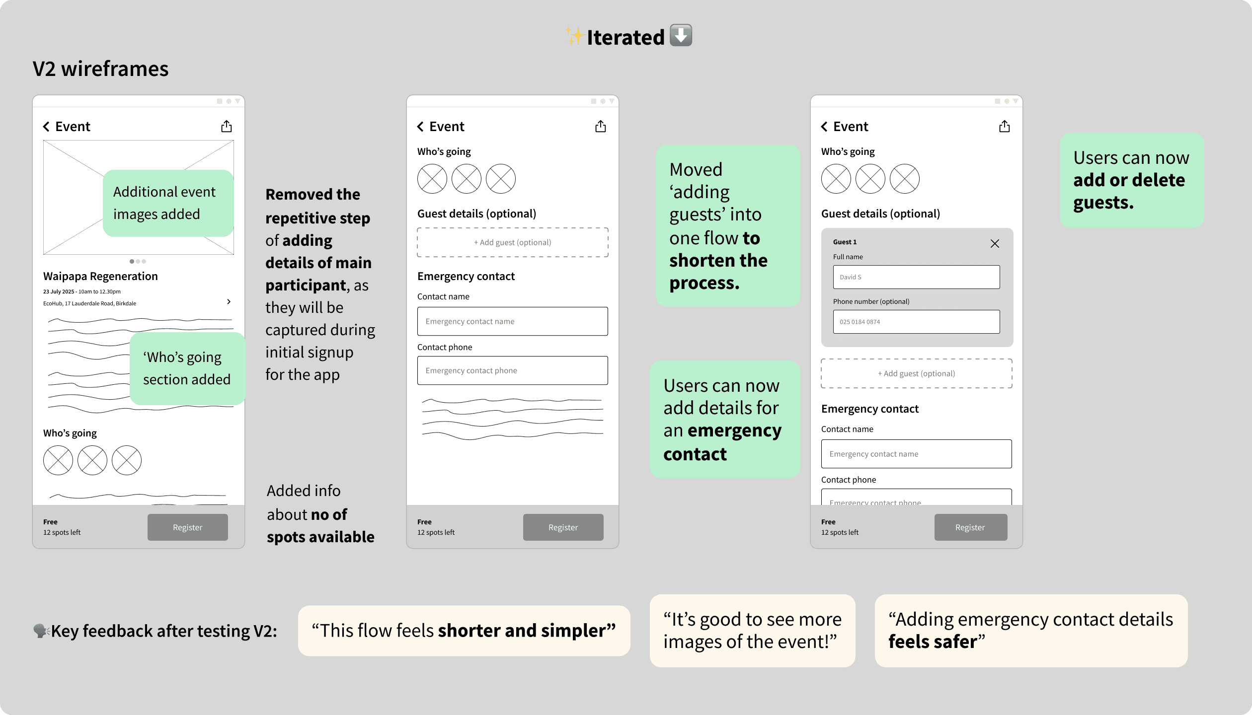
Key things I changed
🪄 Removed the requirement for emergency contact details in the registration flow, instead added it to the profile settings.
🪄 Designed a new overlay for editing RSVP - to give users the flexibility to change their registration whilst safeguarding against accidental clicks.
User feedback
🗣️ "Oh yeah this definitely feels a lot shorter - the ability to add the event to calendar is useful so that I don't forget about it later!"
Help of AI
I used UX Pilot to get some inspiration for high fidelity UI designs.
✨ The prompts
Design the registration flow for Kaipatiki project, an NGO based in Auckland, to help volunteers to register for local planting events. They should be able to register guests up to 5 people in the same flow.
Create a section in the home screen to show once a user has registered for an event. Make sure this event appears prominently with a 'going' status.
Screen thanking users for their registration and providing further event details.


AAA Design System
I created a design system that meets AAA accessibility standards (using Apple Human Interface Guidelines as inspiration) to lay the groundwork for my high-fidelity designs, keeping everything consistent and efficient.
I then brought everything together into a high-fidelity prototype for mobile, ready for user testing.

Hi-Fi designs & testing
🙋♀️ 10 participants total
4 friends I had tested original flow on
4 other friends I had been volunteering with (mixed abilities)


I then brought everything together into a high-fidelity prototype for mobile, ready for user testing.
I decided to include my original test group, who had previously tested the original flow, to also test the new version. Additionally, I recruited four friends I had been volunteering with (all of whom had used the flow before) as well as my partner, who is also familiar with the registration process.
If I had more time, I’d recruit a fresh group to avoid bias and get a broader range of feedback, ensuring a more balanced view of how the redesign works for different users.
I gave them the same scenario I had been using and made sure to measure my key metrics.
Tweaks based on feedback


Added a 'bookmark' button to save events for later.
Added margins for the image, so that everything is in line.
For certain events, there are multiple events throughout the calendar year. This was also raised by Blanka and few other volunteers. So I added a way to select the specific date with a date picker that can be scrolled horizontally.
Used progressive disclosure method to show only the relevant info in the about section.
Added subtle weather indications and related info beneath event details.


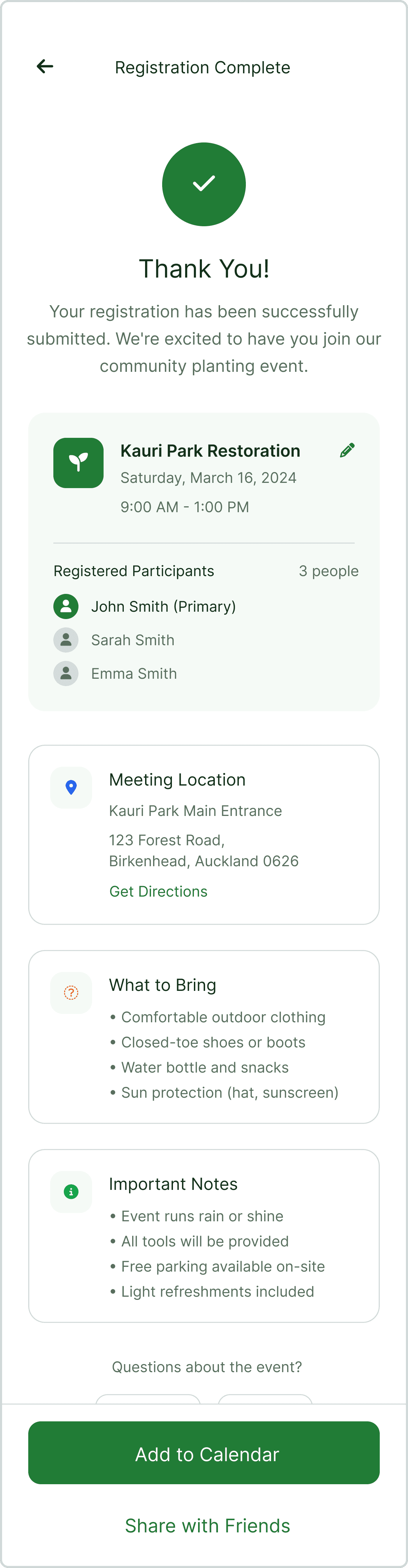
The original confirmation page was looking empty with not much information.
Added a map view of the location with the ability to open the location with Google Maps.
Added the ability to call or email the organization to ask more questions.
Added a button to share the events with others.


Changed the location of the 'You're going to this event' banner to the top so that it's more prominent.
Added the option to edit the registration to the bottom overlay (fixed) so that it's always visible when scrolling.
Original screens & newly designed screens
Choosing an event
Before
After
Registering for an event ➝ editing registration
Before
After
Was my re-design a success? YES.

What I'd do next & Key Learnings
What I'd do next
Fix minor prototyping issues for consistency.
Incorporate more user testing feedback.
Ensure AAA accessibility (resize small buttons).
Expand the design system to cover more scenarios (e.g., donations, e-commerce).
Run A/B tests to refine user guidance.
Plan for multilingual support.
Present final designs with test data to Blanka, emphasizing quick wins like copy tweaks and overlays for cost-effective UX improvements.
If my designs were implemented
I’d track key metrics to assess impact and identify areas for improvement:
📊 Event Registration Numbers – Track the number of volunteers registered for each event. Increases here reflect higher engagement and interest.
📉 Completion Time & Drop-off Rate – Track registration time and abandonment points. A faster flow with fewer drop-offs signals a smoother experience.
🗣️ User Satisfaction Scores – Gather feedback via surveys or in-app ratings. Higher satisfaction correlates with a better user experience and likelihood to return
Key learnings
💡 Clear visual hierarchy is key – Well-crafted layouts and IA reduce errors, improve accuracy, and streamline operations, proving that great design is as much about communication as visuals.
💡 Balancing business and user needs – Hitting the sweet spot between these two is key to good UX design.
💡 Small tweaks, big impact – Simple changes like reordering fields or improving navigation can significantly enhance the user experience.
Next time
I’d deepen my research by testing with real customers and analysing Kaipātiki Project's user data to uncover registration behaviours and pain points. Interviews would provide key insights to refine the flow.
Collaborating with Kaipātiki Project's staff would help identify problem areas using real data and improve my understanding of their backend system to enhance both UX and operations.
Lastly, I’d engage with the developers of the current website to assess implementation feasibility, understand past roadblocks, and identify technical or business constraints.

